Getting Started with Orange Tool
Orange tool is a tool used in the data science.In this blog I will discuss about basic of Orange Tool and its various features.So lets get started.

What is Orange Tool?
Orange is an open-source data visualization, machine learning and data mining toolkit. It features a visual programming front-end for explorative data analysis and interactive data visualization, and can also be used as a Python library.
- Widgets: The various components present in Orange are known as widgets and they are divided into various categories like Data, Visualize, Model, Evaluate and so on.
- Workflows: Orange workflows consist of components that read, process and visualize data. We call them “widgets.” We place the widgets on a canvas. Widgets communicate by sending information along with a communication channel. An output from one widget is used as input to another.
How to use workflows in Orange?
I have created a simple workflow wherein the inbuilt Iris dataset provided by Orange is being used. The workflow is such that data from the dataset is sent to the data table, to Distributions for creating a distribution and a Scatter Plot is plotted from the dataset. To create this workflow we load the dataset using the File widget, and then flow between File-Data Info, File-Data Table, File-Distributions and File-Scatter Plot is created.

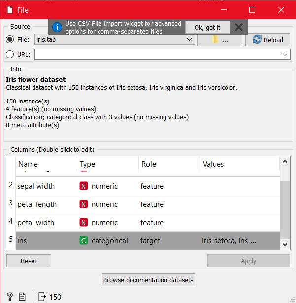
For the data to be loaded in the Canvas, select the File widget from the left pane and place it in the canvas. Double click on the File widget and select the iris.tab file.

How to do basic data exploration (like data distribution, data information).
Data Information
To get the information about the data loaded in the file widget we can create a flow between the File widget and use the Data Info Widget which shows the name, description, row count, column count, features and target values in the dataset in File widget.

Then to view the data in Orange Canvas in the table form, select the Data Table widget from the left pane, place it in the canvas and connect the link between File and Data Table widget. On double clicking on the the Data Table widget the entire data can be seen in the tabular form, where Orange itself decides the Target Variable based on the data received.

Data Distribution
Use the Data Distribution widget to get the graphical representation of the dataset values. Here I got the distribution for various features from dataset.
We can also use the widget of Scatter Plot for plotting for different kinds of feature pairs.

LinkedIn Profile
